Why Looks Matter.
by Sam Dakin
Wow, it’s been way too long to be honest. We’ve been working on so much behind the scenes that we honestly haven’t had a lot of opportunity to breath. As you’ve seen in the past month from our New Packaging Launch. We have been working on something truly leading in the coffee experience space in New Zealand and we believe globally as well.
As a founder I’m often tasked with thinking how we truly stay connected to the reason I started this company and the story that sits behind that. Which is to help people slow down over exceptional coffee. It’s actually challenging to do but I think through subtle design takes throughout this packaging Jonte and I have done exactly that.
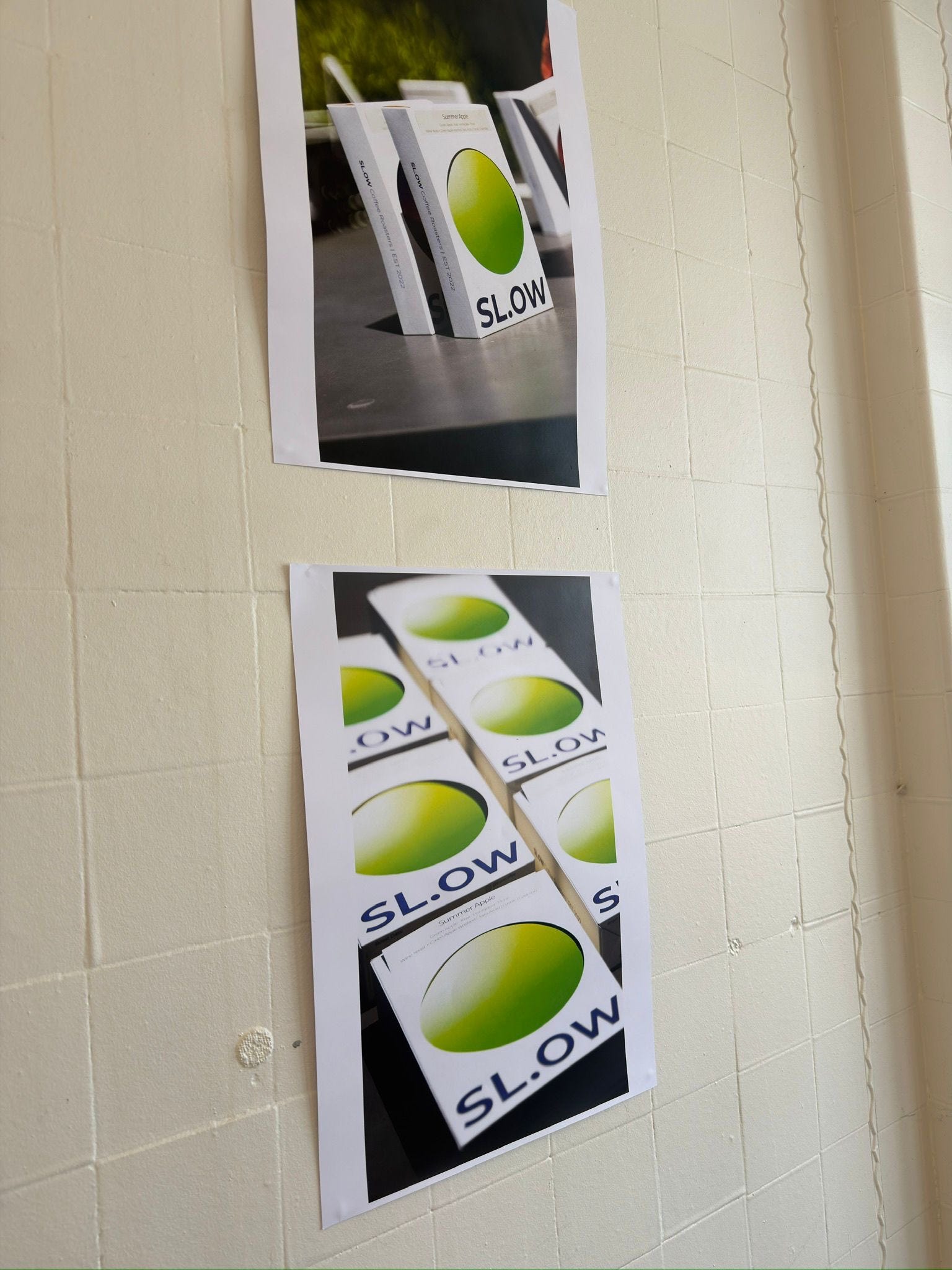
We knew one thing when we designed this. We wanted a bag to be in a box. We are premium brand selling expensive coffee. The consumer must absolutely receive a product that reflects the price. We felt the European way of boxing coffee was the way to do it. We then loved the idea that the box was the shape of a book. Books are a great way to slow and pause and relax. So we felt if our box would make the customer felt connected to something that typically makes them calmer that’s a good start.
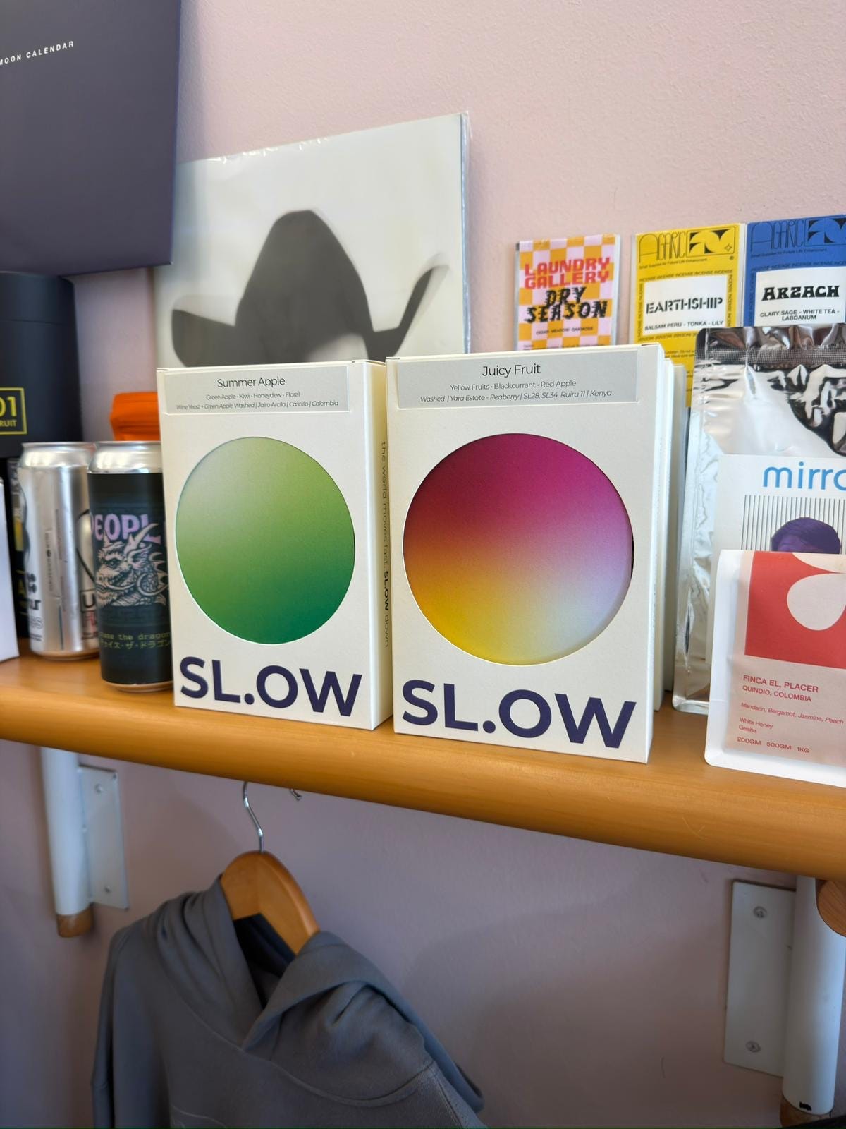
Then we had seen lots of roasters using card inserts to provide information and we had an idea to take the dot from the middle of the slow logo and exaggerate it into the middle of the box where we would place a gradient dot. We felt the gradient colour provided the connection to our last labels and bags but at the same time provided an evolution of the brand expression. We believe gradient colours are our perfect way of telling a visual story of the coffee for our customers. It gives true depth and feel to each coffee.
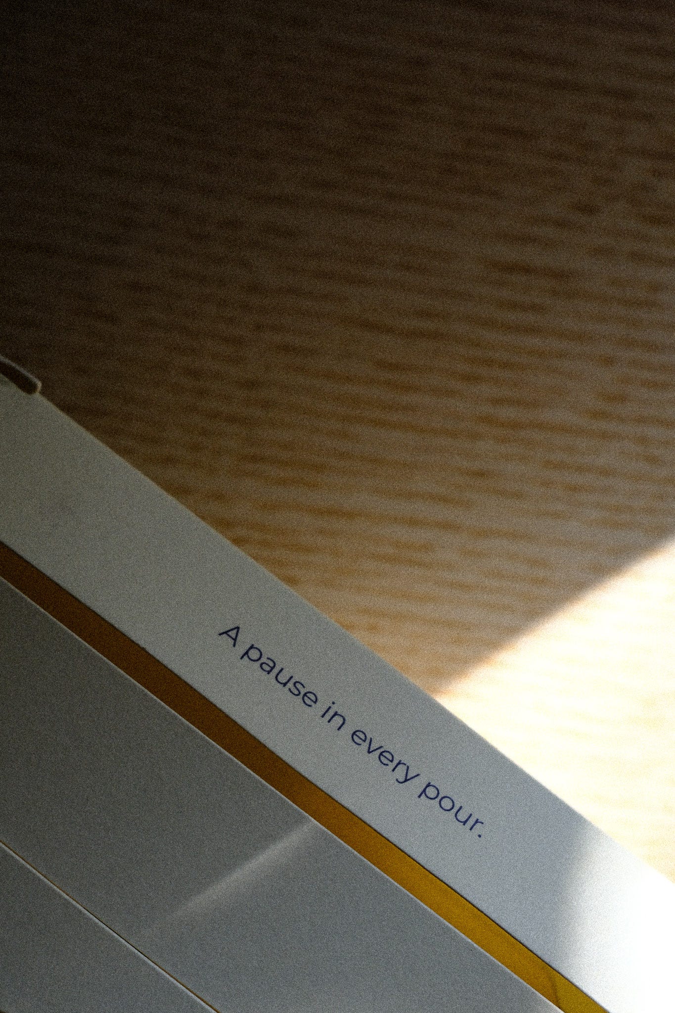
We wanted to ensure we truly lent into our brand mission through this new look. To help people slow down and be more present, through exceptional coffee. We felt the best way to do this was through small quotes throughout the entire box. We feel this is a key product and brand differentiator in the coffee space and truly connects customers to our mission.
This process was not without it’s challenges. Jonte spent who knows how many hours with a our partner Printtech trying to figure out the exact card dimensions to fit in the box perfectly and over probably 50 odd renditions later that is the product you see.
Every single part of this new look was done with true intention. We have cut no corners. You will continue to see this evolve as well as the entire experience. Maybe different coloured boxes, custom courier boxes for NZ shipping. You will just have to wait and see. We have so much planned for 2026.
Personally, from me, THANK YOUUUUU. 2025 was the year SL.OW felt like it became a real business. We’ve had cafe’s around the globe reach out after trying our coffee from customers, we sold in the thousands worth of product and more importantly we are truly starting to understand our customer. (YOU!!)
This year expect us to focus in on community, on events, pop ups and leaning more into our mission. Bi weekly coffee release cadence and some more collaborations.
Finally, a big shout out to Albert and the team at DailyDaily for allowing us to host small launch party before the year ended!
I LOVE THIS JOB. Also also, more substacks this year. I promise!
Happy new year, slow down and live 2026 with intent. Let’s go…!
Sam